
Colour Trends in Curtains: What’s Hot in 2024
by Kristen Phang

The 2024 Colour trends of the interior design world have upended itself in the last six months! Last year, fuzzy peach was predicted to be the top colour for homes. But today, interior designers instead variations of green and sky blue in their designs. Because curtains are used as supporting design elements in a room, their colour trends may differ from trending interior design colours. In Malaysia, chocolate brown or deep navy curtains have become the most popular choices for homeowners!
As of today, there are at least four hot curtain colour trends vying for our attention:
- Chocolate Browns
- Warm Neutrals
- Flora Greens
- Deep Navy
There are so many unique colours to choose from! But how can we pair these colours with current interior designs? What kind of new styles can we try out? Do they even suit our living rooms or bedrooms?
In this article, I will show you the hottest curtain colour trends and how you can choose the right hues and match them with your living areas.
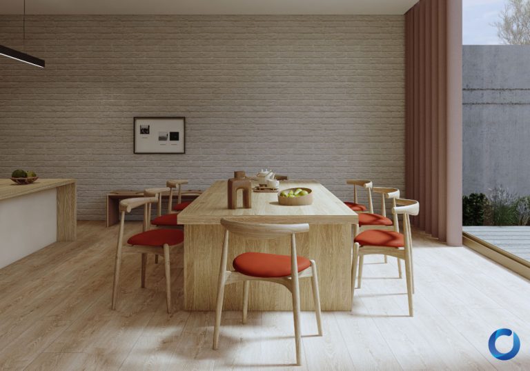
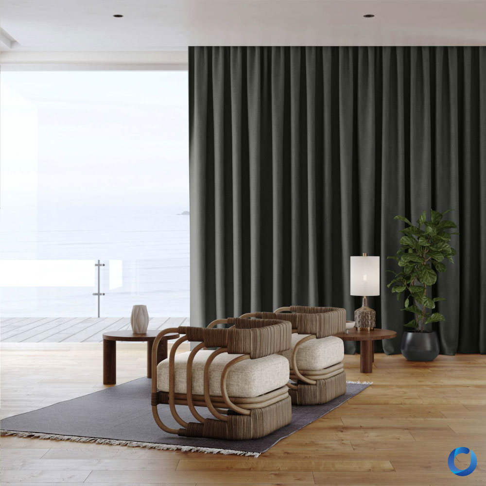
Natural, Chocolaty Browns
The Rules of Chic Curtains.
Who knew food-inspired colours would become one of Malaysia’s top curtain trends in 2024? According to furniture retailers, rich dark brown textiles are a great alternative to pure black fabrics because their off-black hues balance well with lighter colours, unify the room’s colour palette and creates a peaceful, stable and cosy environment. Their dark shades also make it hard to spot stray hairs or light stains on fabrics, making them easier to maintain.
Chocolate browns have become popular because of their positive associations with the sweet treat! Chocolate represents cheerful celebrations, romantic gifts and comforting drinks. Even eating them has been scientifically proven to increase our dopamine levels. It is no wonder that chocolate hue fabrics can add vibrance, positivity and joy to a room.
Some chocolate colour fabrics in Acacia’s vast collections include Winterweave 12-Chocolate, Raider 21-Chocolate and Chief 16 Chocolate. You can even get rich-brown patterned curtains like Electra 19 Cocoa. Interior designers have used caramel, Tudor brown, and bittersweet chocolate!
Because these saturated hues have a neutral base, they are suitable for many colour palettes and room designs. Because natural plants inspire for the chocolate colours, they look amazing for dark nature-themed rooms, especially when paired with sage or pesto greens, warm creams and stone greys. For nature, themed rooms, you can also add rope tiebacks to add texture to the curtain or place large plants as a decorative finish.
Chocolate brown curtains are also a great fit for luxurious rooms because give them a hint of vintage richness to a room. To make your chocolate curtains look grand, try layering them with elegant sheer curtains and pairing them with gold-colours curtain accessories like rods, elaborate finishes and thick tiebacks. Alternatively, you can use metallic finisheslike like silver or copper. Chocolate curtains also great by themselves in industrial and minimalist rooms.
These rich brown curtains are best suited for bedrooms and lounge rooms because their dark colours and warm undertones help make the room feel smaller yet comfortable, like a warm blanket. Unfortunately, it can be tricky to style chocolate brown curtains with lighter aesthetics because the colour can feel “heavy” and hold back the space’s freeing nature.
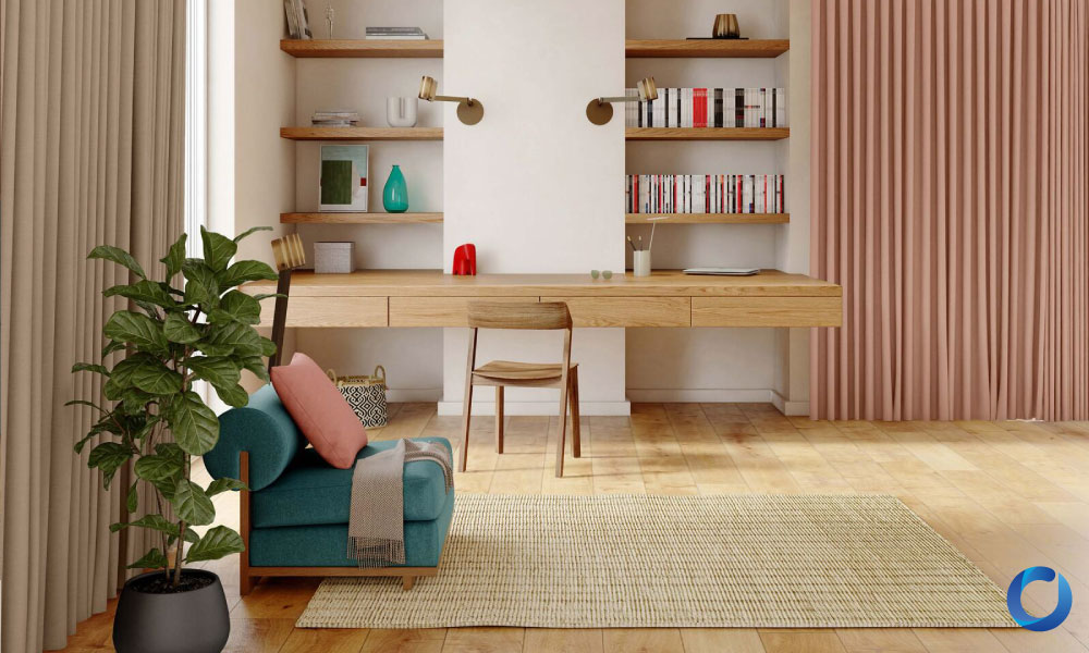
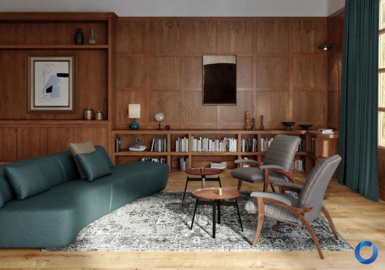
Light, Warm Neutrals
Minimalism has been a popular interior design trend since the early 2000s, with its smart functionality, clean aesthetic, and open spaces. Hence, neutral curtains have become a staple for most homes. Even if you don’t prefer the minimalist style, they are often the bridge that bridges the gap between contrasting colours, add negative open spaces in rooms and completes an interior design.
However, minimalism today has significantly changed! Homeowners have moved away from the cold emptiness of modern minimalism and modelled their spaces with the warm minimalist style. The warm minimalist movement keeps the clean shapes and monochromatic palettes of modern minimalism but adds earthy colours and natural textures of the Scandinavian style.
“Unlike cold undertones, which can make a space feel businesslike, warm undertones help to create a cosy feeling in a home.” – Nate Burkus.
Speaking of undertones, just because neutrals look plain does not mean they cannot significantly affect a room’s vibrancy and mood! Many whites, greys, beiges and browns have cool or warm undertones that can significantly influence our perception of it. For example, pure titanium white can make a room look clinical and professional, while Saint Sauvant white with hints of grey tints can make a room look more muted and earthy.
When shopping for neutral colours, be sure to compare the fabric samples side by side. Fabrics with warm undertones usually look more saturated with red, browns and yellows, while those with cool undertones tend to be lighter yet slightly muted with tints of blue or green.
Swiss Coffee is the number one neutral colour for iconic interior designers like Nate Burkus and Hilary Matt because it is an excellent white with warm undertones. Other options include pearl white with its creamy hues, almond white with its refreshing pink undertones, and fresh kick white, which has a pure white that isn’t overwhelming. Acacia Fabrics’ collections also have high-quality white fabrics with warm undertones that come in all sorts of textures, subtle patterns, materials and delicate weaving patterns like Sheen 02 Pearl, Outshine 01 Almond and Stylo 05 Cream.
When it comes to greys, professional home designers usually pick hues with greenish undertones because they add a sense of serenity to living spaces. Acacia Fabrics also has plain and patterned grey fabrics with similar undertones like Locomotion 10 Cloud, Innovation 04 Feather and Grove 14 Dove.
While neutrals support a larger design, there are still home deco techniques we can use to style with them Hilary Matt, who specialises in monochrome designs, recommends using textures to soften and subset monochrome colours. Subtle patterns or intricate weaving patterns can also give a bit of texture.
Dabito, an expert in colour mixing, also recommends playing with how colours are placed in a room. As he explains:
“Once you have your palette, tie all the spaces together by sprinkling similar colours in each room… It’s easy to colour block with furniture by picking a solid-colour sofa and playing with warm and cool contrasting colours. For example, choose a couch in a warm hue like yellow and pair it with an accent or a coffee table in a cool hue like green.”
Take note that it is easy for neutral colours to become practically invisible if there is not enough contrast between the fabric and other elements in the room. If the walls are painted in light colours, use darker, saturated neutral shades for the curtains and vice versa.
Warm, neutral palettes can help people feel relaxed and focused, so they are great for living rooms, bedrooms, home offices and casual working spaces.
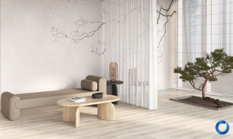
Flora Greens
It’s Just Right
As our world becomes more appreciative of Mother Nature, we have invited nature into our homes. This addition can manifest literally with potted plants or figuratively with natural materials and flora patterns from nature. Earthy colours are in season, but plant-based colours have taken the spotlight because they feel refreshing.
“This trend has been growing in subtle ways, but now, it’s been in full swing and taken more literally by using outdoor elements and indoor imagery. It’s a way to connect us with nature whether you’re in the country or the city. I’ve always considered green as a gateway colour, but it can be made sophisticated by using unexpected combos, like sage, pink, cigar leather, and pine. ” —Max Humphrey.
According to Niko Radsides, the colour’s association with nature, growth, and tranquillity brings a calming sense of “rejuvenation and serenity, transforming the space into an oasis.”. Hence, it’s perfect for rooms designed for relaxation, such as living rooms, waiting rooms, bathrooms, and bedrooms.
Most shades of green seem to have a place in modern designs today, the most popular ones being rich and saturated shades that are not overpowering. Currently, the top three flora hues are sage, olive and moss green because of their unique muted richness. Bolder alternatives include Kelly green and emerald. Personally, I like the growing popularity of ocean green hues like Essex green.
Green surprisingly fits well with many colour combinations. For example, green and golden yellow contrast beautifully and can be adapted into bold styles like Isamu Noguchi’s mid-century living rooms or Mandy Cheng’s cottage core dining room. Green also pairs well with whites, gold and browns.
However, playing with the colour green can be tricky. Like neutrals, greens have a wide variety of undertones. Just because pastel pinks blend well with the mint green’s turquoise value does not mean it can be paired with the yellow undertones of a hedge green. So, before you buy a pair of green curtains, take a careful look at the sample. Does it have a yellow, blue, white or brown undertone? How does it affect the other colours in your living space when you put them side by side?
Duskin Gerken also recommends using pleated or shaped hanging styles for green curtains because the pleats’ shadows and the room’s light will create a natural gradient of colours. He also recommends choosing a hue that won’t blend too much with the plants outside your window.
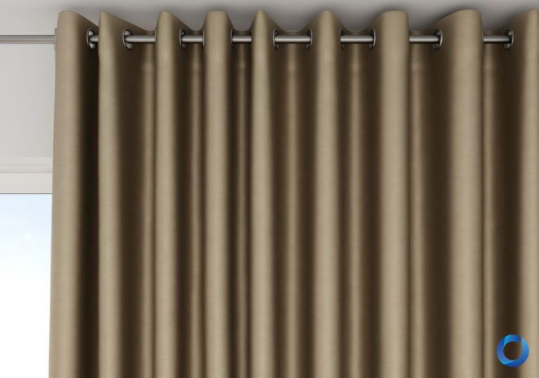
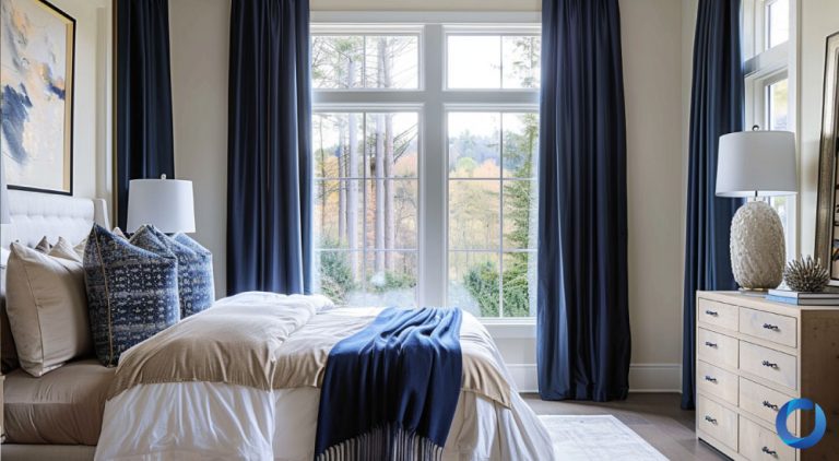
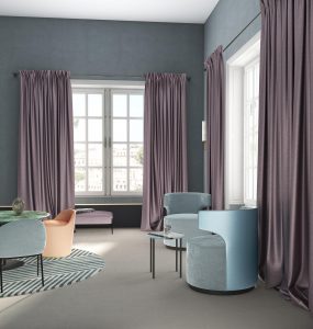
Rich Navy
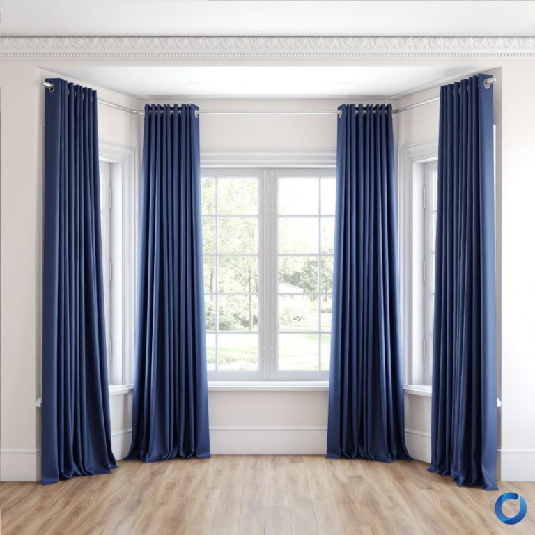
Navy has always been a popular blue shade because represents depth, power and sophistication. It is often used in uniforms to convey professionalism and reliability, making it an excellent choice for office spaces, meeting rooms and front desk areas. It can also make your interior spaces look elegant yet comforting with decorated pillows and metallic furnishings like gold, silver and bronze.
It’s no wonder that navy blue is a popular curtain fabric colour for Malaysians! Like chocolate browns, its deep saturated off-black hues make it easier to maintain and create a balanced contrast with cool colours. Currently, Hague blue is the most popular navy tone. Acacia Fabrics’ collections have a diverse collection of navy fabrics that differ in material, threading techniques and patterns, like Starlight 27 Navy, Sit Out 32 Navy and Eco Stripe 29 Navy.
Blue is relatively easier to style because it does not have many undertones as a primary colour. However, its wide range of shades can significantly impact the scale and lighting of the room. Regarding navy curtains, Carlin van Noppen advises homeowners to hang dark blue curtains in brightly lit rooms because dark shades will absorb sunlight.
While navy is typically used to create grand luxurious bedrooms, it can also be used in casual styles as an accent colour. For example, Navy curtains can help create contrast in a white, grey or beige room, elevating the room’s liveliness and vibrance. It also pairs well with orange and yellow shades, creating a cool contrast and a unified look. These combinations allow you to create art deco compositions, cottage core vibes or light and vibrant modern homes.
Colour trends are a great source of inspiration because they come from years of experimentation by professional fashion designers and passionate home decorators. They give us a fresh look at our rooms and bring us a burst of DIY ideas and home renovation projects. Since curtains are the most accessible and convenient furniture to change, why not take this opportunity to explore new colours and potentially new home decoration ideas? Have fun exploring!
References
Edwards, S. (2023, December 1st). Martyn Lawrence Bullard’s bold bathroom tiles ‘signal a shift towards daring interiors’ in 2024, according to designers. Homesandgardens. https://www.homesandgardens.com/interior-design/martyn-lawrence-bullard-bathroom-tiles
Gage, E. N. Eyers, M. B. (2024, May 14th). Meet Our 2024 Color Stars: 10 Designers Who Make Decorating with Color Easy. Better Homes & Gardens. https://www.bhg.com/2024-color-stars-8623843
Ireland, R. F. (2023, August 17th). Unlike cold undertones, which can make a space feel businesslike, warm undertones help to create a cozy feeling in a home . House Digest. https://www.msn.com/en-us/lifestyle/home-and-garden/hgtvs-nate-berkus-shares-his-favorite-neutral-paint-colors-and-theyre-gorgeous/ar-AA1fmrSm
Leal, S. (2024, January 9th). These Are the Hottest Decor Trends Coming in 2024, According to Interior Designers. Cosmopolitan. https://www.cosmopolitan.com/lifestyle/a46297473/interior-design-trends-2024/
Spaces Team. (2023, December 8th). Pantone finally revealed its colour of the year – here are all the shades expected to trend in 2024. The Spaces. https://thespaces.com/colours-of-the-year-2024-trend/
The Biggest Home Decor Trends For 2024. (2024, January 10th). The biggest Home Decor Trends for 2024. https://bobbyberk.com/the-biggest-home-decor-trends-for-2024/
Tonelli, L. (2019, March 6th). 20 EYE-CATCHING COLOR COMBINATIONS TO ELEVATE YOUR HOME. Elle Decor. https://www.elledecor.com/design-decorate/color/g26629581/best-color-combinations/
Warwick, S. (2023, 8th February). The curtain colour mistakes that could be ruining your entire decorating scheme – here’s what to avoid and why. Homes and Gardens. https://www.homesandgardens.com/interior-design/curtain-color-mistakes
Articles suggestion
If you are searching for the perfect curtain to express your personality at home, talk to our sales representatives in here.
Read more
worry-free fabrics
featured brands


